For most small businesses, a logo on its own quietly underperforms. Here is what a real brand kit actually contains, when a logo alone is enough, and when the investment in a system pays for itself.
It’s a question we hear in almost every conversation with a small business owner at the start: “do I need branding, or is a logo enough?” The short answer is, it depends. The honest answer is that, in nine cases out of ten, a logo on its own will underperform. We’ll get into why, when the tenth case actually does apply, and what’s actually in a full kit, in case you decide it’s worth the investment.
Before any of that, let’s clarify what each one is. In practice, people use the word “logo” for two very different things, and that’s where the confusion starts.
01.What a logo is, what branding is, in plain language
A logo is a visual sign. A mark, an emblem, something that identifies a business at a glance. Useful, but limited to that.
Branding is a different thing. It’s the system that lets your business be recognized and trusted every time someone meets it, whether they see the logo or not. It contains the logo, yes, but it also contains the color palette, the typography, the way you talk to customers, the kind of photography you use, the templates you apply across surfaces, and the written rules that hold all of it together. Basically, everything a stranger should feel consistently by their third interaction with your brand.
Marty Neumeier, in The Brand Gap, offers a definition worth memorizing: “a brand is a person’s gut feeling about a product, service, or company.” Your brand lives in what the customer feels when they meet it. Anything you say or write about it counts only to the extent it shapes that feeling. Branding is the work of building and cultivating that feeling, over time.
David Aaker, another major name in the field, describes brand identity as a multi-dimensional system: a core identity, a personality, the relationship with the customer, the value proposition. The logo is just one of the surface pieces of that system.
British designer Michael Johnson sums all this up with a metaphor that captures the idea well. The logo is the flag above the waterline. The identity system is the iceberg below it. The better the iceberg is built, the more there is behind the flag when it’s raised.
02.Why a logo on its own almost always underperforms
Let’s get concrete: what do you actually lose, in practice, when you have just the logo, without the rest of the system?
You lose consistency. Without written usage rules, every employee, every freelancer, and every supplier who touches the logo applies it slightly differently. By the tenth application, you have ten slightly different versions of your own brand. The customer doesn’t catch each difference, but they feel, subconsciously, the lack of coherence. And the default reaction to incoherence is a drop of distrust.
You lose recognition when the logo isn’t visible. Instagram posts, emails, presentation slides, packaging, the sign at the entrance, all of them should feel, to a stranger, like the same business. Without a palette, a typeface, and rules, they end up being nine different businesses that happen to share a logo.
You lose market differentiation. If all your competitors use the same kind of stock photography, the same crops, the same filters, your brand dissolves into everything the customer sees. The system (a written photography direction, templates, a palette outside the category cliché) is what pulls you out of the pack.
You lose continuity when you’re not the one there. Your brand lives, in practice, in your head. The moment you’re busy, switch photographers, or bring on someone new for social, everything starts from zero. A written style guide is the single source of truth that takes you out of the equation.
Byron Sharp and Jenni Romaniuk, who studied tens of thousands of brands empirically in How Brands Grow, confirmed something intuition already senses. Brands with multiple “distinctive assets,” such as a signature color, a signature typeface, a character, a sound, a recognizable visual application, grow more consistently than ones that lean on the logo alone. The logo alone is one asset. A system gives you five or six, working together.
03.When a logo alone is enough (honestly, because not everyone needs everything now)
We should say the other side too, because not every business needs the full kit from day one.
If you’re a small operation, run by a single person, with a single public touchpoint (one Instagram, or one physical shop), and no plans to grow in the next six months, a well-made logo plus a short palette and a carefully chosen typeface can be enough. At that stage, a full system would be over-engineered. The equivalent of building a roof for a house with two walls.
The dividing line is simple: your brand starts getting applied by someone other than you. The first employee. The first freelancer. The first campaign with an outside supplier. The first new location. That’s where, without a system, everything we described above starts piling up, and the investment in a complete kit starts paying for itself.
As a rule of thumb, if you’re applying the brand across more than two or three surfaces (Instagram plus website plus business card is already three), you’ve already left the logo-only zone.
04.What’s actually in a brand kit
For someone who hasn’t bought one before, the most useful question is concrete: okay, but what do I actually get when I buy a brand kit?
A properly built kit contains a few layers:
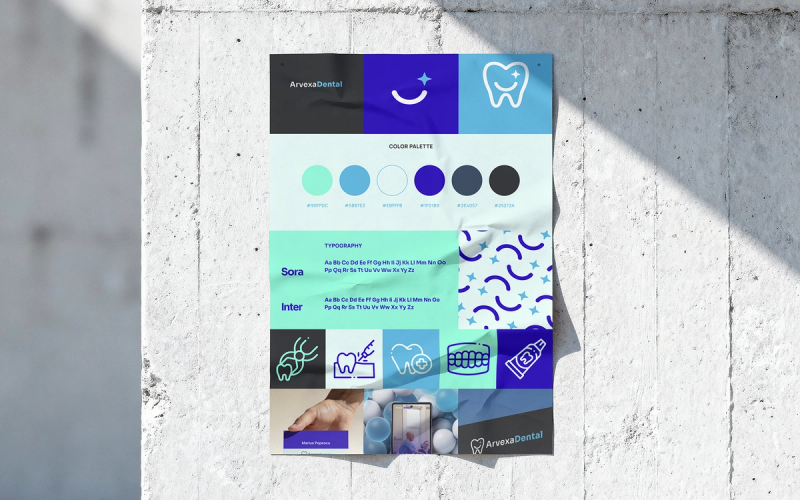
- A logo with all its variants (horizontal, vertical, monochrome, favicon, dark-background variant). A complete set of files that covers any context where your brand shows up.
- A color palette, with each color’s role (primary, secondary, accent) and the exact codes for web, print, and screens.
- Typography, chosen for legibility and character, with clear usage rules for headings, body text, and accents.
- Written usage rules (the style guide), a PDF anywhere from 4 to 30 pages depending on complexity. Everything gets documented here, so it stays consistent whether you apply it yourself or someone else does.
- Templates for the main applications: social media (Instagram, Facebook), presentations, invoices, business cards, email signatures. The ones you reach for most.
- A written photography direction, built as principles that guide every photo taken in the brand’s name: mood, framing, treatment, subject, what to avoid.
- A voice-and-tone paragraph, for when you write in the business’s name. How the brand sounds when it has a voice: formal, warm, playful, precise, which words it reaches for, which it avoids.
- For regulated niches (medical, beauty, legal, financial), the kit also includes a compliance layer with specific rules on what you can and cannot communicate. We wrote about this more concretely in the piece on dental clinic visual identity.
Depending on the size of the business, the kit can be a starter pack (logo, colors, typography, two or three applications, a short guide), a full version with web direction and brand voice, or a custom engagement for a business with multiple locations or multiple service lines. We wrote about how a complete identity translates into a website that converts in the previous piece in this series: what a dental clinic website needs to include. The principles are the same for any business, only the examples change with the niche.
05.Why it’s worth it, in three concrete benefits
Looking back at everything we’ve described, the benefit of a brand kit comes down to three practical things.
Real differentiation. In a market where every clinic, every restaurant, every salon looks vaguely the same, a system that breaks out of the category cliché pulls you out of the pack without shouting.
Faster trust. Visual consistency is a competence signal. The customer doesn’t catch it consciously, but they feel it. A consistent brand earns trust by the third interaction; an inconsistent one loses it by the second.
Continuity beyond you. The moment your brand can be applied correctly by someone other than you, against a written guide, the business stops being tied exclusively to your presence. That is literally the difference between a business that depends on its founder and one that can grow.
At GOODGLYPH we work on exactly these principles. We build brand kits as functional systems, calibrated to the actual size of the business. If you’re trying to figure out where you sit on the spectrum, from just-a-logo to a full kit, let’s talk. We start from a conversation about where you actually apply the brand, and from there we work out what you really need.
Frequently asked questions
Yes, as long as the logo is built with the intention of fitting into a complete system later, with a compatible palette and typography. If the logo arrives as an isolated decision, you'll pay twice down the line: once for the logo and again for everything around it. Even our €149 Brand Kit includes the palette, type and templates, not just the logo on its own.