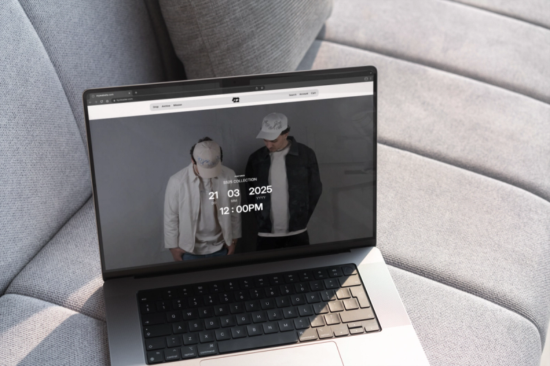
A pretty website and a website that brings you clients can be two very different things. Here are the five questions a site has to answer in the first few seconds, and what stands between that page and a visitor who decides to contact you.
There’s a question we hear in almost every first conversation with a small business owner: “I have a website, it looks decent to me, but I’m not getting any clients off it. Why?” In nine cases out of ten, the answer comes down to three things: the structure of the page, the clarity of the message, and the friction that builds between the visitor and your “contact me” button. Aesthetics is usually a smaller factor than people assume.
A pretty website and a website that brings clients can be two very different things. In this piece we’ll go through what your visitor is actually looking for in the first few seconds, the structure that answers it, the conventions you shouldn’t break, the friction that loses everything you’ve built, and why, as the owner, it’s very hard to see where it breaks on your own.
01.The five questions every visitor asks in the first ten seconds
There’s a simple rule, validated by almost any usability research you can find: every visitor who lands on a site answers five questions, consciously or not, within the first ten seconds. If they don’t get clear answers to all of them, they close the tab.
The five questions, in the order they come up:
- What does this business do? In concrete terms. “A dental clinic in Sector 3” is clear. “Integrated oral wellness solutions” stays ambiguous.
- Is it for me? Meaning: does my profile match theirs (location, price level, type of service, style).
- How is it different from my alternatives? A visitor almost always has two or three other options open in other tabs. If they can’t see what separates you, they pick at random or on price.
- What do I do next? Do I call? Message on WhatsApp? Fill in a form? Send an email? There has to be one obvious path, and only one.
- Can I trust them? The biggest anxiety, the one expressed least. Reviews, real photos, a named team, concrete signs of competence.
In April Dunford’s language (Obviously Awesome, 2019), these are a reformulation of the “five plus one components of effective positioning” (market category, alternatives, unique attributes, value, customers, and context trend), applied to the moment a visitor lands on the page. Dunford frames them as a strategic exercise, but at the end of the day the visitor runs through them as a practical decision in the ten seconds spent on your homepage.
02.The structure that answers the five questions
A website that converts is, quite literally, a website that answers, in order, the five questions above. That means a very concrete structure on the home page:
- The header (the area above the fold) covers questions 1 and 2: what you do and for whom, in one line. Plus the obvious action button (the answer to question 4). Donald Miller calls this the Grunt Test: someone glancing for three seconds has to be able to say what you sell, for whom, and how they buy.
- The value proposition section (below the header) covers question 3: how you’re different. Two or three concrete benefits, no generalities.
- The steps or plan (usually three) re-covers question 4: how it all unfolds, from the first click to the result.
- The proof section (reviews, client logos, real photos, concrete numbers) answers question 5: can I trust them.
- The long text and the inner pages are for the people who actually read, plus for SEO. This is where the details, the FAQ, and the service pages organized around what the client searches (not your jargon) live.
We wrote in detail about this structure, in Donald Miller’s nine operational sections from StoryBrand, in the previous piece (we applied it there to a dental clinic, but the logic is the same for any business): what a dental clinic website needs to include. Here we’re just naming which question each section answers.
In practice, what we’re describing is exactly what we deliver in a complete brand and web kit. The structure, the copy that answers the five questions, the templates and the style guide that hold it all together, plus the identity that dresses the page.
03.The conventions you shouldn’t break
There’s a recurring temptation, especially when you work with a designer who wants to “break out of the mold,” to mess with the basic conventions of a website. Move the menu somewhere else. Represent the cart differently. Use unclickable things as if they were clickable. Steve Krug, in Don’t Make Me Think, is very direct on this. Don’t make the visitor think about things they already know. The logo sits in the top left. The menu sits at the top or down the left side. The cart has a cart icon. Links look like links.
Your differentiation lives in the brand, in the message, in the photography direction, in the voice, in the palette, in the typography. That’s where it’s worth being bold. On the interaction layer, you bank the conventions, because the visitor needs to orient themselves without thinking. That speeds up the build, keeps your margins healthy if you’re a small business, and pulls artificial barriers out of the visitor’s way.
04.The friction that loses visitors even when the structure is good
You can have the perfect structure and still lose visitors, if there’s friction between them and the moment of contact. Friction takes very concrete shapes:
- The form asks for too much. Most small business sites ask for name, phone, email, message, subject, source (“how did you hear about us”), and a pre-checked consent box. Half the visitors give up. Luke Wroblewski, in Web Form Design, showed that the form is the biggest single bottleneck on any conversion funnel. Ask for the absolute minimum; the rest can wait until after they’ve contacted you.
- Navigation hides things. The contact page buried under three clicks. The phone number tucked into a footer. The address on a sub-page. Anything critical for the next step has to be at most one click away, ideally visible in the header.
- The page is slow. A page that takes more than three seconds to load on 4G loses, according to Google’s published data, more than half of its visitors. For a business that pays for ads, that’s half the budget gone before anyone sees the offer.
- Mobile is treated as an afterthought. Design was done on desktop and “adapted” for the phone. And most of your traffic comes from a phone. For most niches, mobile should be the design’s starting point.
- Trust signals are missing exactly where the decision happens. The contact button is there, but there’s nothing around it to confirm trust: no review, no real photo, no team name. The visitor pauses on the threshold and walks away.
The simple recommendation: open your own site on your phone, in incognito mode, like a complete stranger, and walk through each friction point with a stopwatch. Anywhere you lose more than five seconds, there’s a real conversion cost.
05.Why, as the owner, it’s very hard to see where your site breaks
There’s a problem designers call the “curse of knowledge.” You know where the contact button is, because you’ve stared at the site for two months. You know exactly what your services mean, because you’ve sold them a hundred times. You know how you’re different, because you live with that in your head every day.
A new visitor knows none of that. They arrive cold, scan for ten seconds, decide. And when you look at your own site, you can’t see what they see, because you’re too close to it. It’s like trying to read your own writing with someone else’s eyes.
The only fix is external. Someone from outside, looking at the page with a new visitor’s mind. That’s also what we do in the first meetings with a new client. We walk through their site with the five questions and a stopwatch, exactly like a visitor who has never heard of their business.
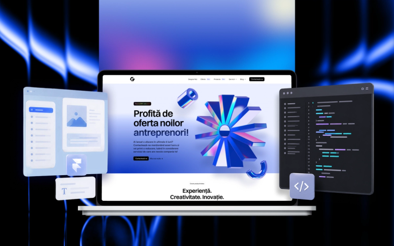
06.How it all comes together as a complete kit
Everything we’ve described, in concrete terms, is what we deliver in a well-built brand and web kit. In short, the package contains:
- The visual identity (logo, colors, typography, usage guide), which answers “can I trust them.” On what a good identity contains, in detail, we wrote in the piece about branding or just a logo and, on a specific niche, in the piece about dental clinic visual identity.
- The site structure (the five or six core sections, plus the inner pages), which answers the five questions in the visitor’s head.
- A compliant copy starter (text that answers clearly, without jargon, and that respects the rules of your niche if it’s a regulated one).
- Templates for the recurring applications (social media, a treatment plan if you’re in medical, invoice, email signature), so the brand stays consistent between the site and the rest of your communication.
- A written style guide (a PDF), so everything stays in place no matter who works on the materials later.
A kit built this way is a system that answers the right questions, from the visitor’s first touch to the moment they message you on WhatsApp, with the minimum friction possible. It contains the files, yes, but the real difference is that it works as one coherent whole.
07.Let’s talk concretely about your site
If you’re reading this and recognize four or five of these points on your own site, you don’t need to start a rebuild overnight. The most useful first step is a conversation in which we look at your site together, through the five questions and the five sources of friction. Out of that, usually, comes a short list: what to change now, what to change over iterations, and whether a complete kit is the right answer, or a smaller intervention.
At GOODGLYPH we build brand and web kits on exactly these principles, calibrated to the size of your business. If you’d like us to look at where your site stands now, and what should change for it to bring clients, let’s set up a call.
Frequently asked questions
Between 4 and 7 weeks for a standard presentation site (5–7 pages). With custom integrations or automations (booking, payment, CRM), the timeline grows to 8–12 weeks. All with two feedback rounds included.